“Innovation occurs because someone had the courage to take a step into the unknown and wasn’t afraid to fail.”
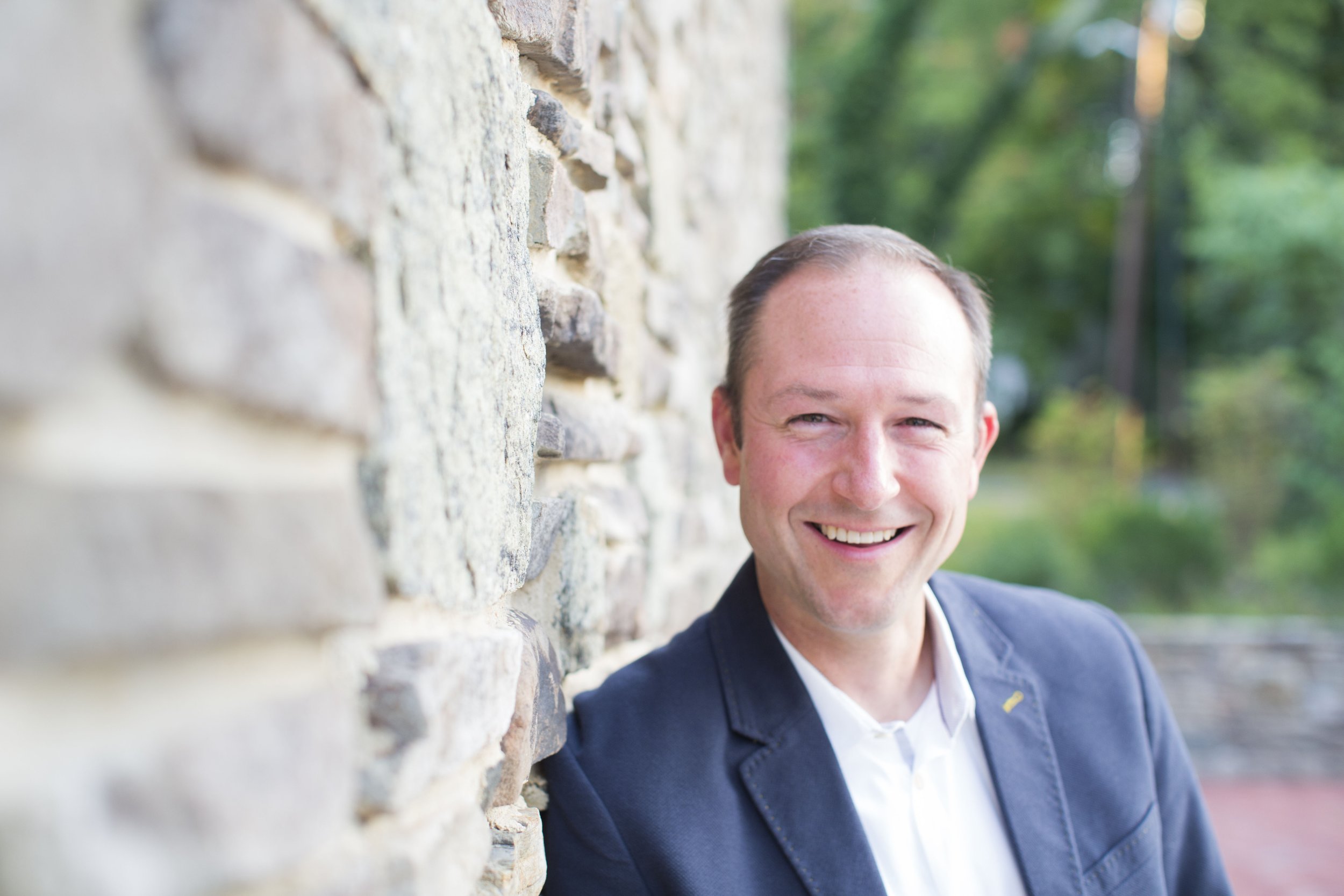
Hi, I'm Joe Schwendt. People often describe me a change agent and technology evangelist; someone who lives for digital transformation. I personally seek out challenges where I can apply my extensive experience across a wide array of industries to make the world better than the day before. I love to solve problems by crafting the right mix of technology, process and people.
Work
I’m currently Senior Director, Head of Mobile & Web Technology at Fresenius Medical Care where I’m helping to build the next generation of kidney care technology.
I also run a boutique technology consultancy, Runway Hero, which focuses on helping companies with digital transformation, building bespoke applications, sourcing products and building integrations. I’ve helped companies in the healthcare, e-commerce, hospitality, travel, food, religious and sports industries to transform the way they operate.


Previously I enjoyed stints at Orrick (large global law firm), Veeya (AI based travel app), Sanofi (large global pharmaceutical), ReferralMob (crowd-sourced recruiting), Apperian (mobile application management), Intel (global chip producer) and Booz-Allen & Hamilton (government contractor). I've had the privilege of building over 175 mobile apps, managing global incident response for Intel and deploying border control systems all over the world.


Life
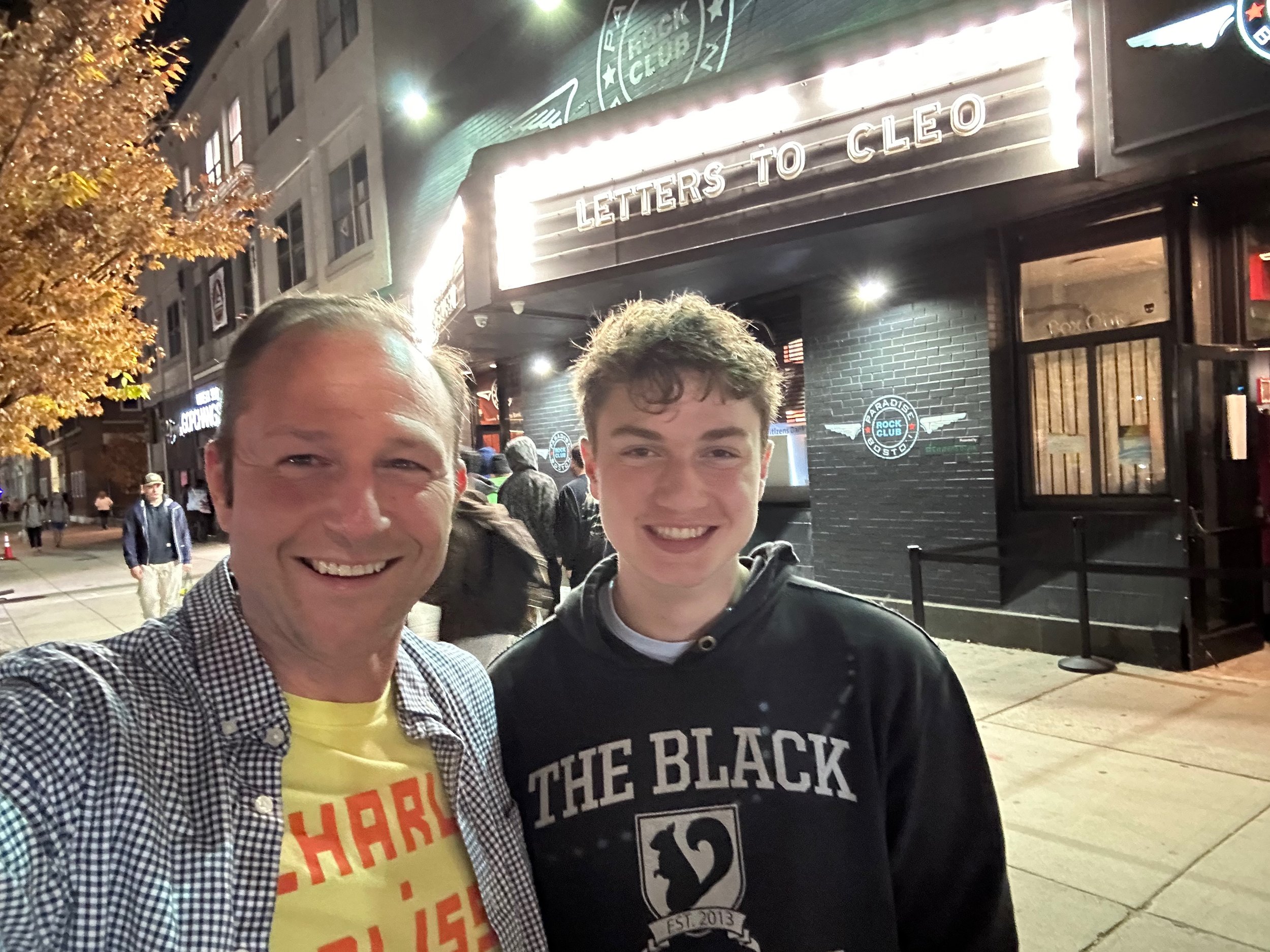
I love live music and usually go to about 10 shows a year. Screaming Trees, Pearl Jam, Weezer, OK Go, Letters to Cleo, Bastille, Cake, Faith No More, Blind Melon…

I also love to travel and explore. I’m currently learning to fly my 1978 Piper Arrow III, which is based out of KOWD (Norwood, MA).


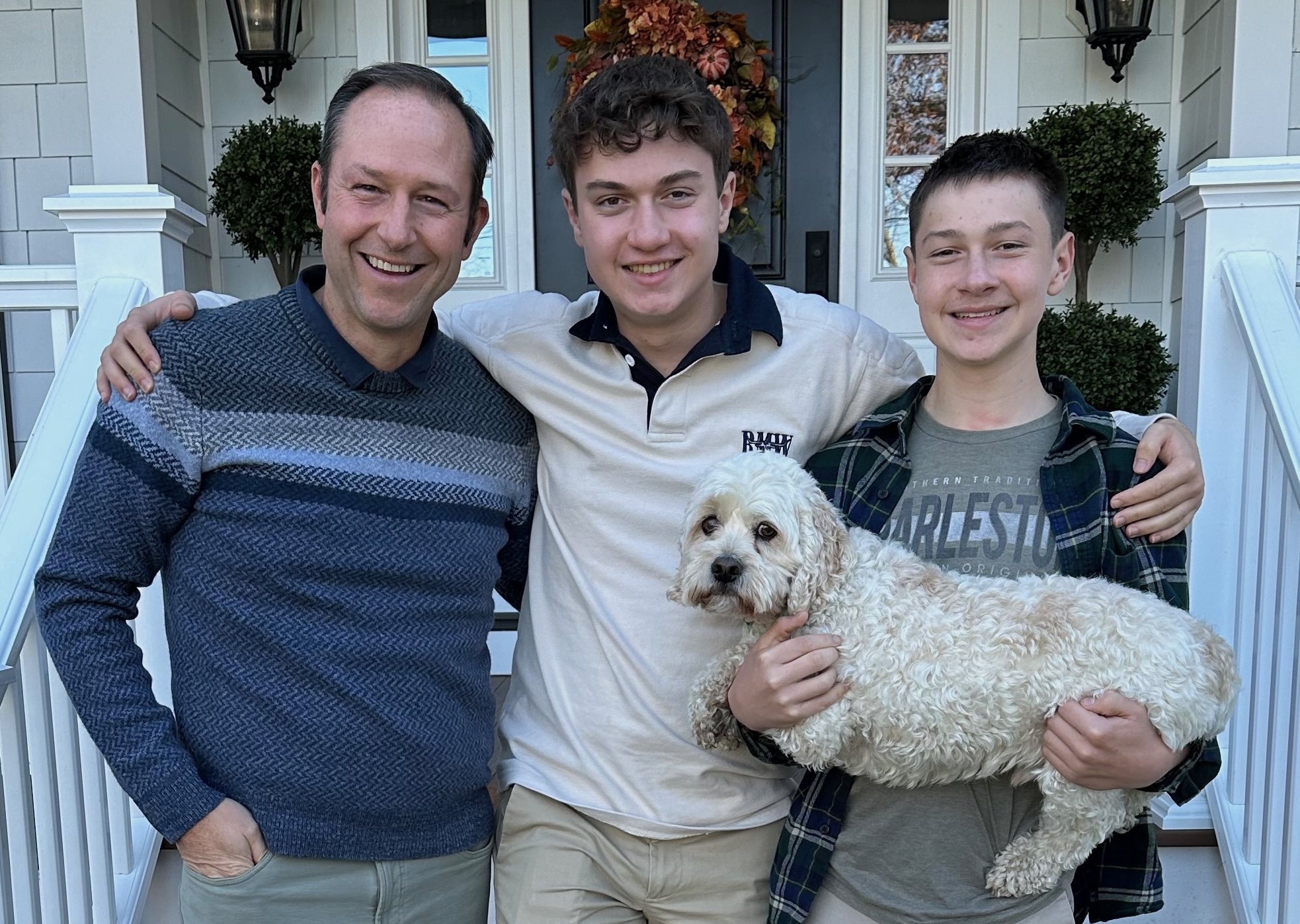
Devoted dad of 2 awesome boys and the cutest little pup. I’m so proud of them and all they have accomplished. I’m constantly surprised by how much they’re now teaching me.
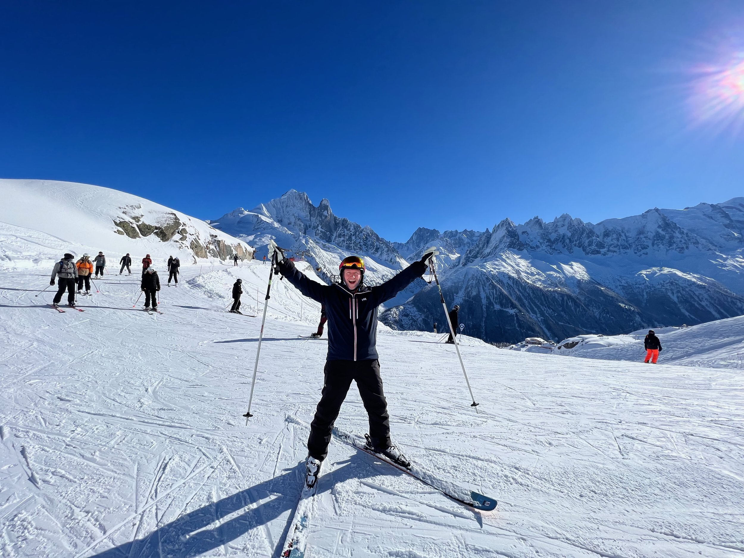
I actively curl (vice), alpine ski (~30 days a year) and golf (always in the rough). I also walk at least 5 miles every day.


Michelle Benfer is my partner in life and love. We build each other up and make each other better. I’m beyond lucky to have her by my side.